Viewport Scrollbar
The viewport scrollbar customization controls whether OHIF uses:
- the new progress-based scrollbar (
viewportScrollbar.variant: 'progress'), or - the legacy range-input scrollbar (
viewportScrollbar.variant: 'legacy').
When using 'progress', stack and acquisition-plane volume viewports run in full progress mode (fills/endpoints/loading options apply - see below), while other slice-capable viewports run in minimal mode (indicator only).
Advanced: viewportScrollbar.indicator
viewportScrollbar.indicator sets the progress indicator’s outer size (totalWidth, totalHeight, border included) and a renderIndicator function. The platform passes React into renderIndicator so the same shape works from plain window.config files (use React.createElement there instead of JSX). If totalWidth, totalHeight, and renderIndicator are not all valid, the default pill indicator is used.
For richer UI, declare the override in an extension getCustomizationModule (or another .tsx module) where you can return real JSX from renderIndicator.
To read layout while drawing the indicator (track size, loading state, isDragging, etc.), use useSmartScrollbarLayoutContext from @ohif/ui-next inside a small React component that you return from renderIndicator (for example return <MyIndicator /> or React.createElement(MyIndicator)). Do not call that hook directly in the renderIndicator function body: that function is not a component render, so hooks would break the rules of React.
viewportScrollbar.variant
| ID | viewportScrollbar.variant |
|---|---|
| Description | Controls which scrollbar implementation is rendered. Use progress for ViewportSliceProgressScrollbar and legacy for ViewportImageScrollbar.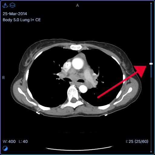 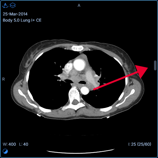 |
| Default Value | progress |
| Example | |
viewportScrollbar.showLoadedEndpoints
| ID | viewportScrollbar.showLoadedEndpoints |
|---|---|
| Description | Shows/hides loaded-range endpoint caps in full progress mode (stack or acquisition-plane volume). 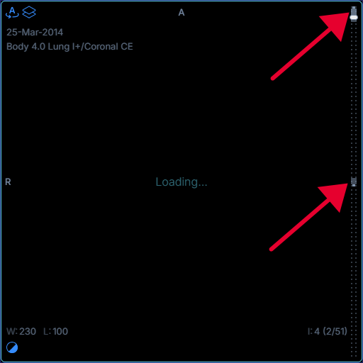 |
| Default Value | true |
| Example | |
viewportScrollbar.showLoadedFill
| ID | viewportScrollbar.showLoadedFill |
|---|---|
| Description | Shows/hides the loaded/cached fill track in full progress mode. 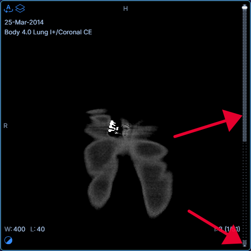 |
| Default Value | true |
| Example | |
viewportScrollbar.showViewedFill
| ID | viewportScrollbar.showViewedFill |
|---|---|
| Description | Shows/hides the viewed fill track in full progress mode. 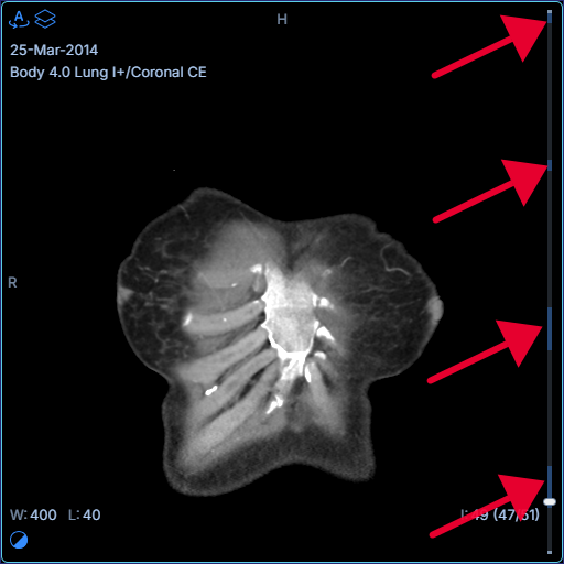 |
| Default Value | true |
| Example | |
viewportScrollbar.showLoadingPattern
| ID | viewportScrollbar.showLoadingPattern |
|---|---|
| Description | Shows/hides the dotted loading pattern for full progress mode. Minimal mode always disables this pattern. 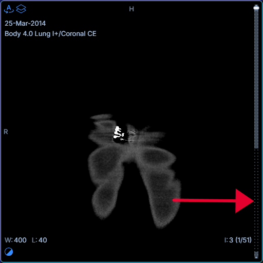 |
| Default Value | true |
| Example | |
viewportScrollbar.viewedDwellMs
| ID | viewportScrollbar.viewedDwellMs |
|---|---|
| Description | Minimum time in milliseconds the current slice must stay on screen before it is marked as viewed in full progress mode. 0 marks immediately. |
| Default Value | 0 |
| Example | |
viewportScrollbar.loadedBatchIntervalMs
| ID | viewportScrollbar.loadedBatchIntervalMs |
|---|---|
| Description | Coalesces loaded/cached slice state changes into a single UI update at the configured interval in full progress mode. Lower values feel more responsive but trigger more re-renders; higher values reduce render churn but can make progress updates appear delayed. Set to 0 for immediate updates. |
| Default Value | 200 |
| Example | |
viewportScrollbar.indicator
| ID | viewportScrollbar.indicator |
|---|---|
| Description | Outer size ( totalWidth × totalHeight, border included) and renderIndicator for the progress scrollbar indicator. renderIndicator receives React for config file compatibility. All three properties must be provided or the default pill is used. See Advanced for TSX overrides and useSmartScrollbarLayoutContext. |
| Default Value | {} |
| Example | This example sets a |